


Build a Warehouse Digital Twin Without Writing Code
Data foundations without scripting
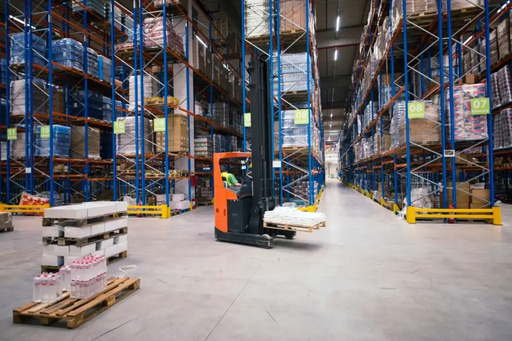
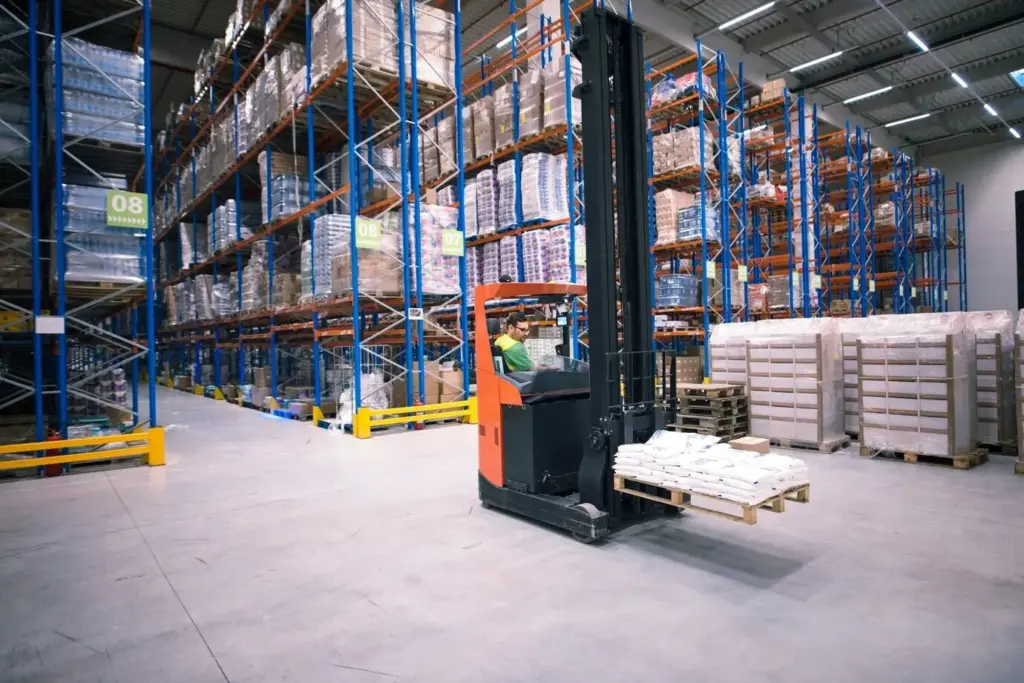
Visual layers and zones

Version control for layouts

Simulate Movement with Drag-and-Drop Logic

Order wave generation

Travel time estimators

Resource constraints and shifts
Hypothesis-driven changes

Factorial planning made friendly
Baseline and rollback safety
Metrics, Dashboards, and Decision Clarity
Throughput and service levels
Track how many orders and lines exit each process by hour against service targets and cutoffs. Visualize backlog accumulation when waves collide, and test adjustments to release timing or batch sizes. Show not only averages but percentiles that reveal late tails. Decision makers appreciate seeing the trade‑off between aggressive promises and the staffing required to keep them consistently.
Heatmaps and congestion insights
Generate occupancy and wait-time heatmaps across aisles and workstations, then overlay different layouts to see bottlenecks shift. Validate improvements by comparing peak hour snapshots rather than daily totals. Use simple color scales and callouts so busy supervisors can react immediately. Sharing before and after images in update emails builds momentum and keeps scattered stakeholders engaged and supportive.
Cost and ROI estimations
Convert travel and handling minutes into labor cost using your blended rates, and translate reduced congestion into equipment deferral or smaller overtime exposure. Summarize payback under conservative, expected, and optimistic cases, with sensitivity sliders for volume growth or wage changes. Tie each assumption back to a source so finance partners can vet and trust the recommendation.

Calibration, Validation, and Trust You Can Defend
Collaboration, Governance, and Rollout Without Friction

All Rights Reserved.